Navigation Redesign
OBJECTIVES
The project was meant to accomplish the following things:
- Create a scalable and adminable navigation system that enables Primary to do more product storytelling.
- Drive desktop users to PLPs rather than PDPs without negatively impacting the key metric: Add to Bag rate.
- Address user-facing experience, accessibility information architecture, and product naming issues present in the existing navigation.
- Align with established interaction patterns and best practices.
- Update visual design to be consistent with refreshed brand style guide.
BACKGROUND
Many factors motivated this navigation/landing page redesign project:
- Product assortment growth: Primary’s navigation had been the same since they launched in 2015 with just a few dozen products. By early 2019, the product assortment had grown to 300+, and it had become more and more challenging to communicate the the assortment within the existing navigation without breaking it.
- Desire for more product storytelling: The creative and merchandising teams wanted to do more editorial storytelling and to communicate seasonality. Editorial emails had historically been high performers, but there was no way to leverage that content in the site experience, which seemed like a significant missed opportunity.
- Quantitative & qualitative data: Analytics data and usability testing observations showed significant UX issues, especially in the desktop experience:
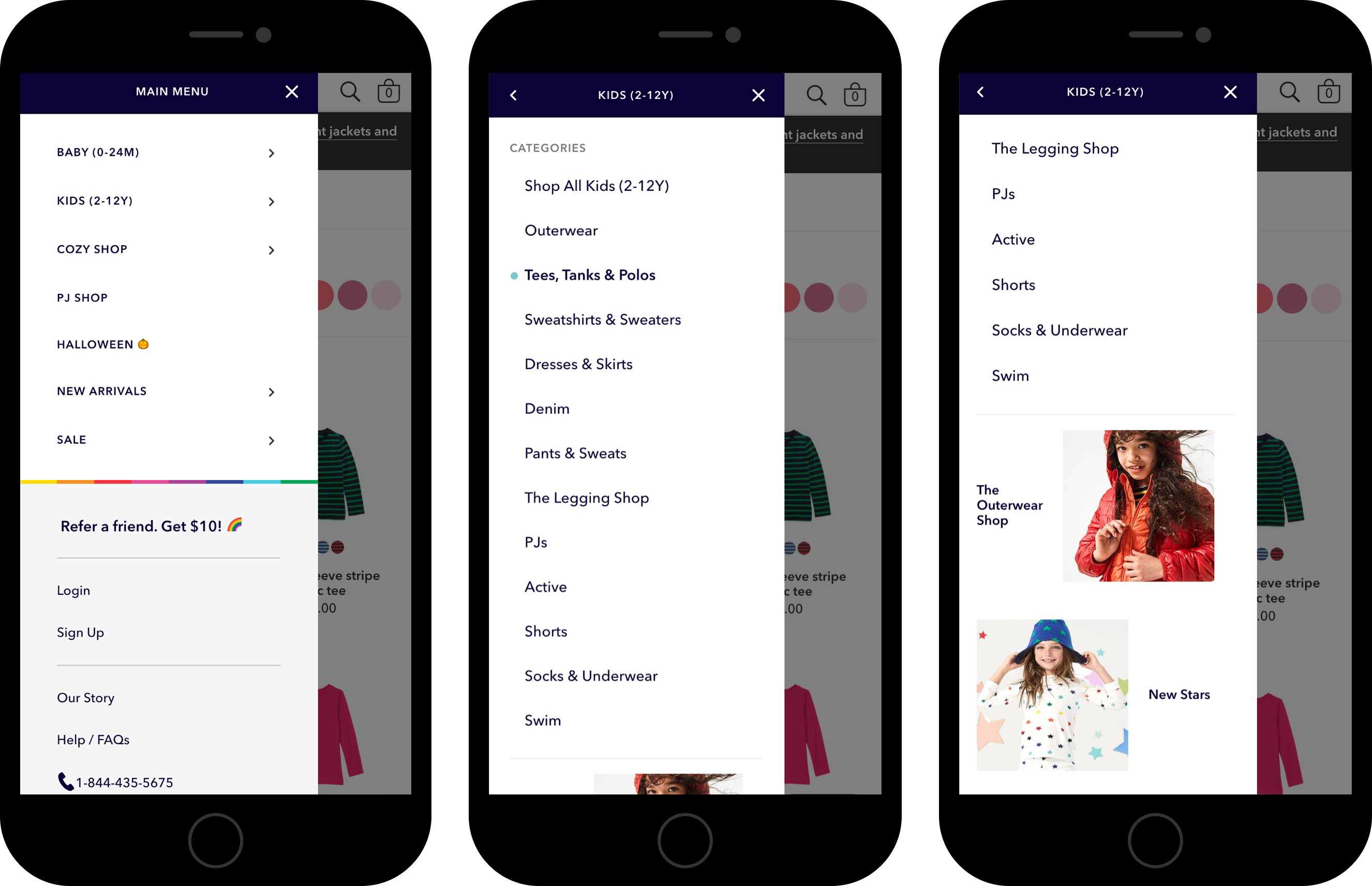
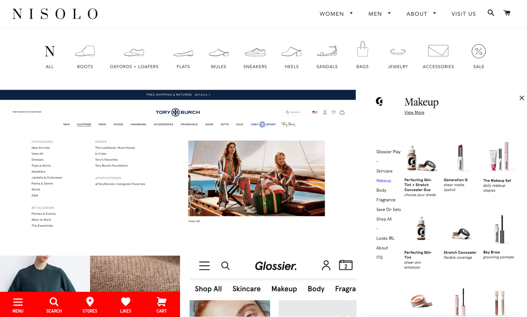
- In testing, desktop users (who make up ~70% of purchases) struggled with flyouts because small hover areas required precise mouse movements.
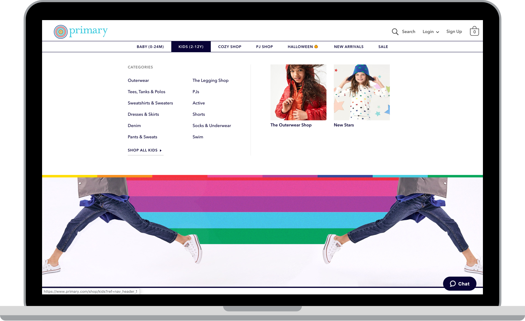
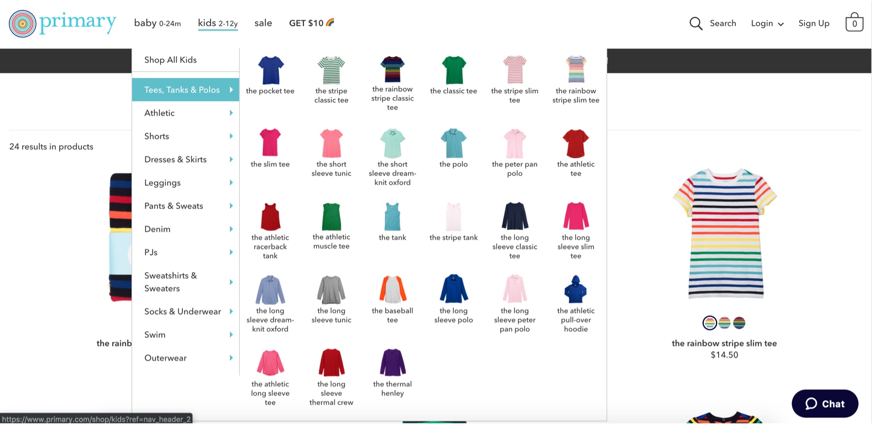
- Within the desktop flyouts, products were shown as small thumbnails that were difficult for users to see. This wasn’t a good way to showcase our products.
- Analytics showed that most desktop users wouldn’t reach a product landing page (PLP) and would instead go directly to product detail pages (PDPs). Once there, it was difficult for users to view more products because they would need to go through the navigation again, amplifying the usability issues.
- Analytics also showed that the default “top 10” category flyout was by far the most interacted-with, which suggests that users might have missed the ability to view other categories for products more specific to their interests.
- Non-standard product naming: Primary had been using some unconventional terms to refer to its product categories, (e.g. “babysuits” instead of “bodysuits” and “Per4orm” instead of “active”).
- Rethinking the product taxonomy: There were also plans in the works to reorganize products according to internally understood attributes like cut and fabric. But I was skeptical and wanted to see how users would naturally categorize our products.
DESIGN & IMPLEMENTATION PROCESS
The design process was collaborative and agile, with twice-weekly progress check-ins between design and engineering and daily standups. My role in this process was essential, as detailed below.
1. Research
- Compiled existing user research & data and conducted stakeholder interviews.
- Conducted visual cardsorting of kids & baby products using Optimalsort.Results:
- Most users talked about how they would organize their children’s closets by seasonality. Instead of arranging things by cut or fabric as merchandising had originally planned, they tended to arrange things by category, and then by seasonal attributes like sleeve length.
- This is important, because most other retailers’ product assortments would naturally reflect seasonality as they phase products in and out of stock, but Primary’s assortment had always been intended to be evergreen, so this was a critical piece of insight for the business.
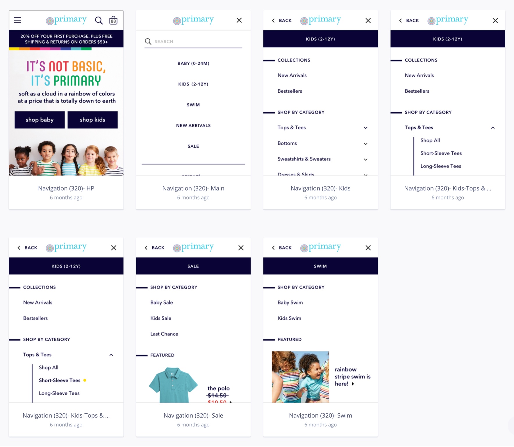
- Conducted competitive analysis and competitive user testing with help from our UX researcher to quickly validate general directions for desktop and mobile. We were trying to decide between a few different interaction models on desktop and mobile, as shown below. Results:
- I narrowed the options down to a traditional hamburger menu on mobile and simple text-based flyouts on desktop, with space for some editorial content.
- These were both the most common patterns in our competitive analysis and the ones that users preferred, likely because of their familiarity.
2. Design
- Sketched multiple desktop and mobile concepts based on research to quickly run by engineers and stakeholders.

- Created low fidelity designs in Sketch, which I used to gather feedback from engineers and stakeholders. Made revisions based on their feedback.
- Tested medium-fidelity desktop & mobile InVision prototypes with help from our UX researcher and made minor visual revisions. Desktop PrototypeMobile Prototype

- Created pixel-perfect production-ready designs to communicate with engineers in Zeplin.
3. Build
- Collaborated with engineers and stakeholders on design & interaction details and reasonable content limits for the CMS
- Lead extensive QA of the design to ensure that it aligned with the design system, and worked with engineers to refine final visual design and animations
- This navigation is currently live at Primary.com!
4. Test
- After implementation, we conducted internal usability testing of the final product before releasing it to the public as a 50/50 A/B test for one month.
- We also conducted post-launch usability testing with external users experience to validate that the final product worked as expected for users.
RESULTS
The project was considered a success, and after the A/B test validation, we released it to 100% of users.
Metrics-wise, we increased PLP view rate on desktop by 15%, and decreased PDP view rate by only 4%. There were no changes to PDP/PLP view rate on mobile or to our lead metric, add-to-bag rate, on desktop or mobile. Given the unchanged add-to-bag rate, we concluded that it's a positive trade-off since more users are progressing down the funnel than before.
In usability testing, users didn’t run into any of the previous usability issues, and were able to navigate more quickly to their desired categories. They also had an easier user flow going from Navigation to PLP to PDP and back to PLP.
With the new design, we were able to double the number of top-level categories that could be shown from 4 to 8, allowing Primary’s navigation to be more seasonal and editorial. Internal stakeholders were thrilled with the new editorial content slots and the ease with which they could change the navigation.